Against The Odds
Landscape only

Please rotate your device

This proposal is built for a wide screen. Turn your phone sideways to view it.

Against The Odds
Proposal · July 2026
Website redesign

Twelve pages. One decision to make.

A rebuild of againsttheodds.uk around the two things that actually convert — the evaluation data and a single obvious next step.

12
pages designed
24
screens, desktop + mobile
What you told us

The brief, in your words

"There's too much content, especially treatment. You get bored."
"Get the real evaluation data on there. Five or six figures each side."
"A video on both pages. Me on prevention, Connor on recovery."
"Design it for people our age. Would you get in touch with these guys?"
Plus: Connor's three pricing tiers, better case studies, and rename The Locker Room.
Approach

Three rules for every page

01
Half the words, twice the pace

Long paragraphs became cards, lists and figures. Recovery lost roughly half its copy and reads better for it.

02
Proof before persuasion

The evaluation numbers sit directly under each route on the homepage, then again on the page itself.

03
One next step per screen

Book a workshop, or get support. Prices are on the page, so nobody emails to ask what it costs.
Structure

Two routes, twelve pages

Every page below is designed and signed off in both dark and light mode.
01
Homepage
02
About
03 · Prevention
Workshops
04 · Prevention
Workshop detail
05 · Recovery
Recovery coaching
06
Projects
07
Case study
08
News
09
News post
10
Contact
11 · Convert
Book a workshop
12
ATO Recovery app
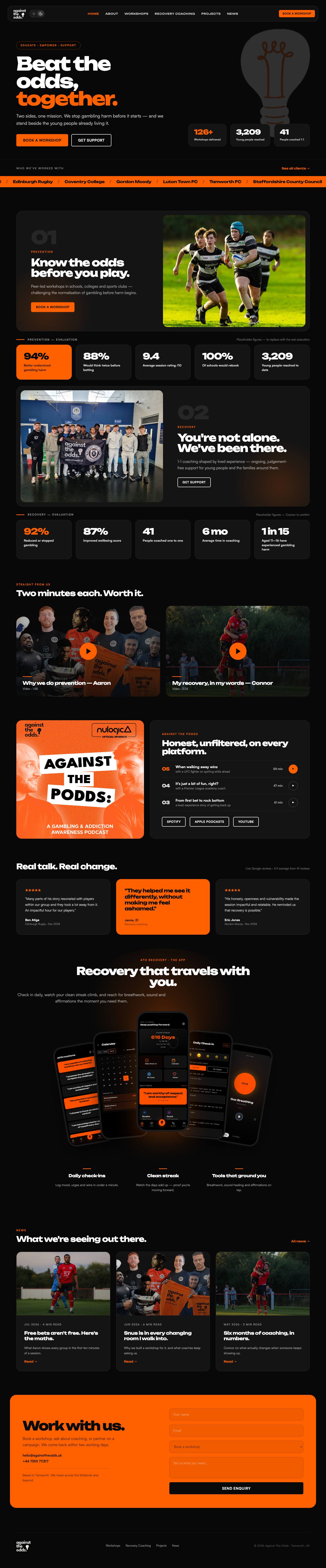
01 · Homepage

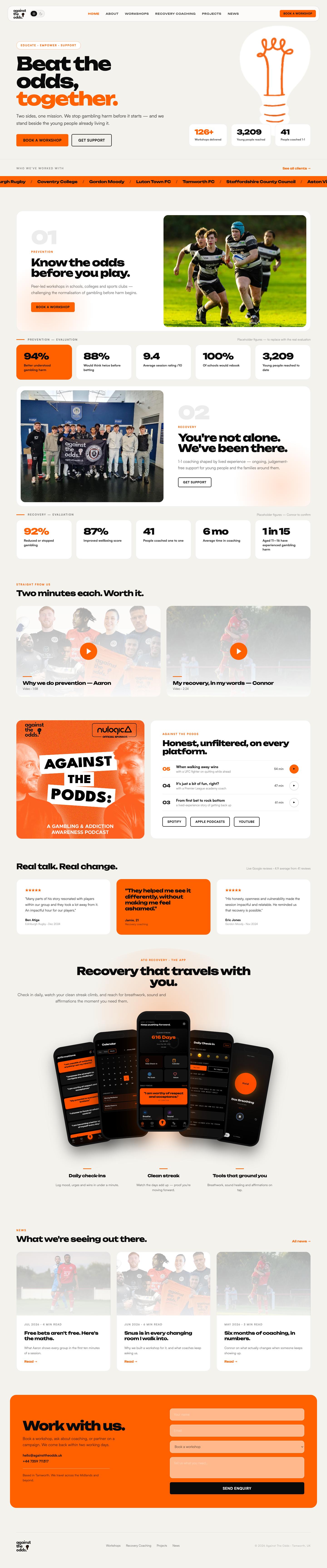
Both sides of the mission, above the fold

Signed off — iteration L
againsttheodds.uk
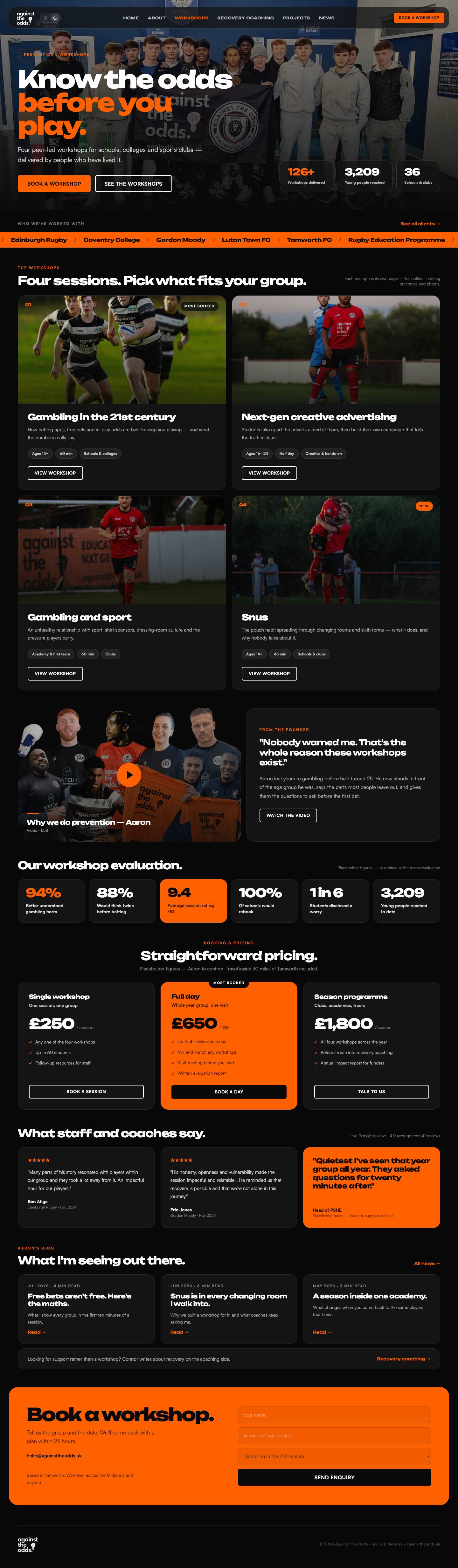
Homepage design
Hero
"Beat the odds, together." Three headline figures, two buttons, nothing else competing.
Two routes
Prevention and recovery each get a block, and the evaluation strip sits straight underneath.
Videos
Aaron on prevention, Connor on recovery — two minutes each, side by side.
03 · Prevention

Five workshops, priced and bookable

Signed off — iteration 02
againsttheodds.uk/workshops
Prevention page design
Workshops
Each one a card: who it's for, how long, what changes. Ten seconds to understand.
Pricing
Fixed and flexible options shown openly, so schools can budget without a call.
Evaluation
94% understood harm better, 100% of schools would rebook — set against your own session photography.
04 · Workshop detail

One page per workshop

Signed off — iteration 03
againsttheodds.uk/workshops/know-the-odds
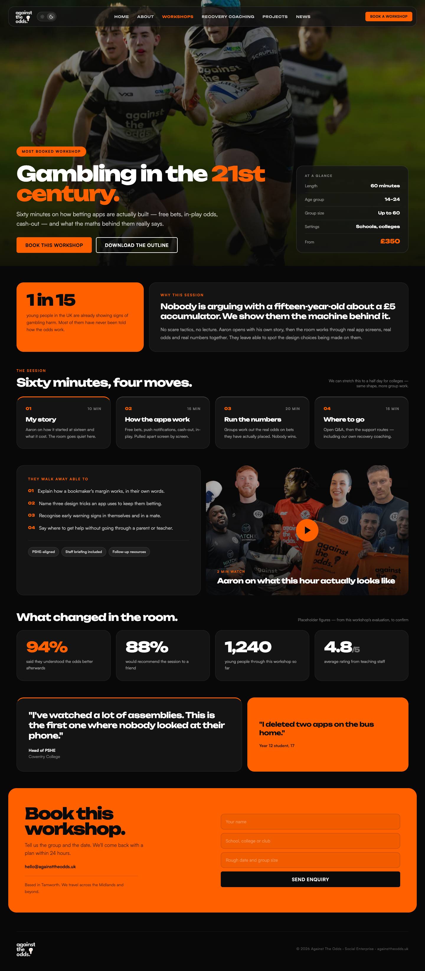
Workshop detail design
At a glance
Age range, group size, length and price sit in one strip at the top.
In the room
A short numbered run-through of the session, not three paragraphs of theory.
Sticky CTA
Book this workshop follows you down the page and hands off to the booking form.
05 · Recovery coaching

Connor's story, then three ways in

Signed off — iteration 5
againsttheodds.uk/recovery-coaching
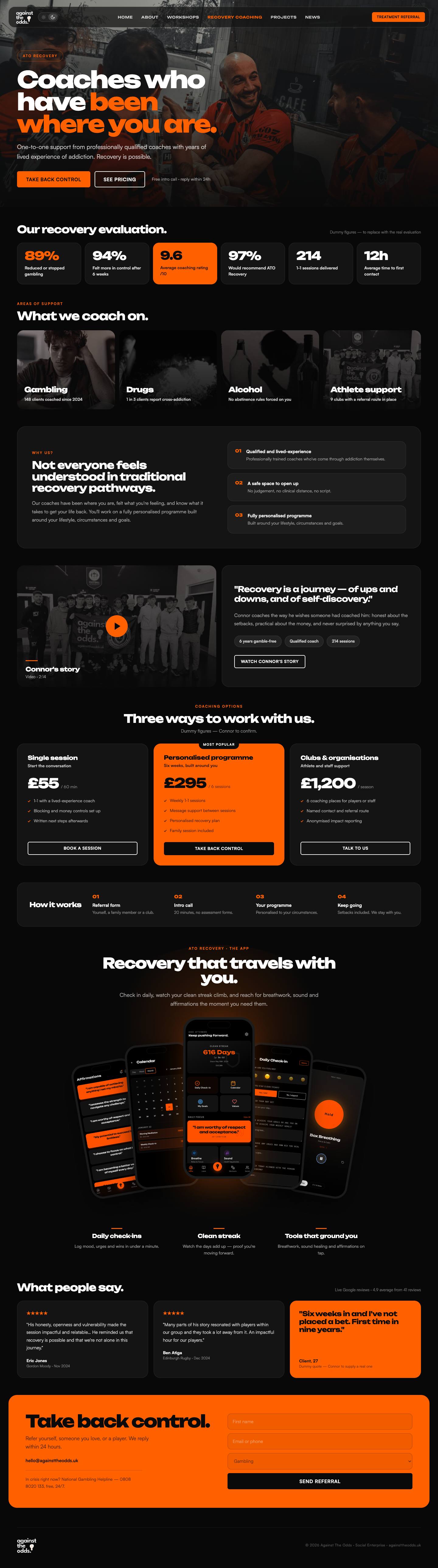
Recovery coaching page design
His words first
Connor's story opens the page, with his video sat inside it rather than buried below.
Three tiers
Single session, block of six, ongoing. Middle tier marked as the one most people take.
Recovery data
92% reduced or stopped gambling, 41 people coached — in half the page length of before.
Evaluation

The data, on the page

Five figures per side, in a strip that repeats on the homepage and the page itself. All placeholders until you and Connor confirm.
Prevention
94%
better understood gambling harm
88%
would think twice before betting
9.4
average session rating out of ten
100%
of schools would rebook
3,209
young people reached to date
Recovery
92%
reduced or stopped gambling
87%
improved wellbeing score
41
people coached one to one
6 mo
average time in coaching
1 in 15
aged 11–16 have experienced harm
06 · Projects

Who you've worked with, named

Signed off — iteration A
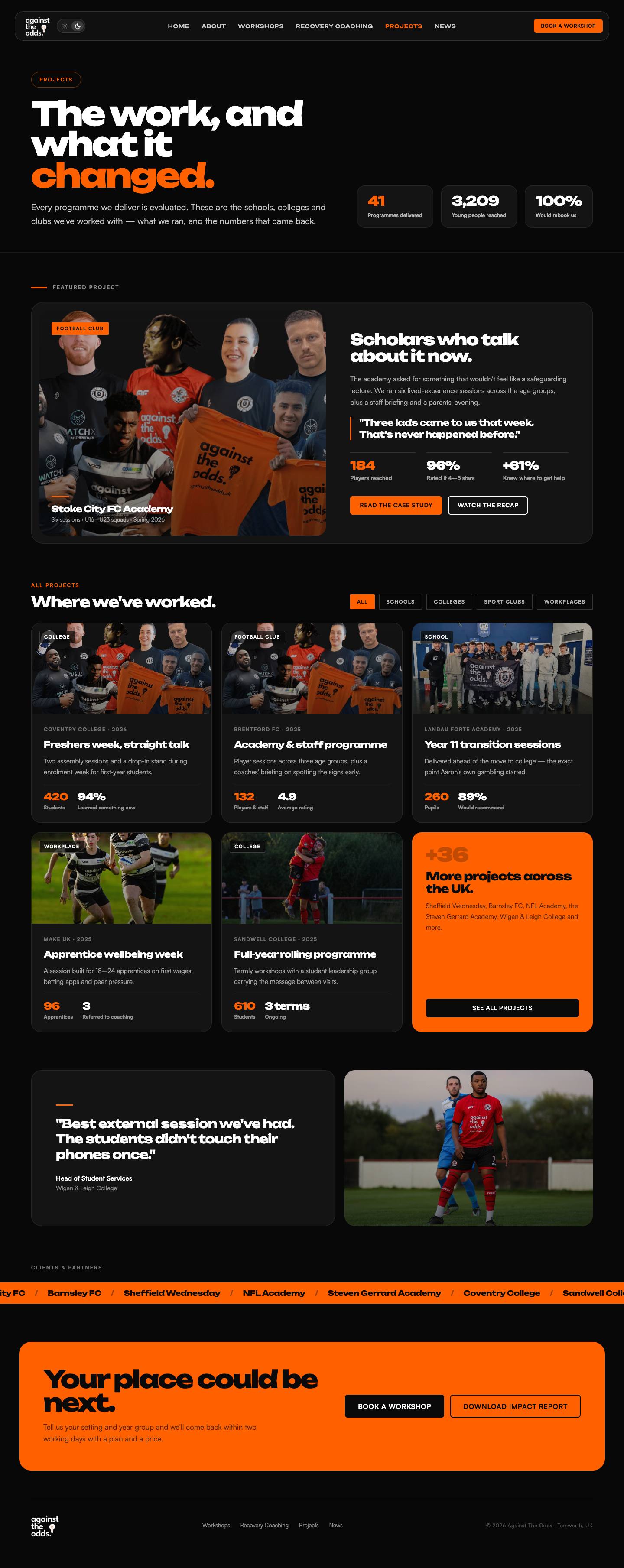
againsttheodds.uk/projects
Projects page design
Client wall
Edinburgh Rugby, Luton Town, Gordon Moody, Staffordshire County Council, Tamworth FC.
Filters
Schools, sport, community, partners — so a prospect finds someone like them fast.
Result on the card
Every tile carries one number, so the grid reads as evidence, not a logo dump.
07 · Case study

One template, every client

Signed off — iteration A
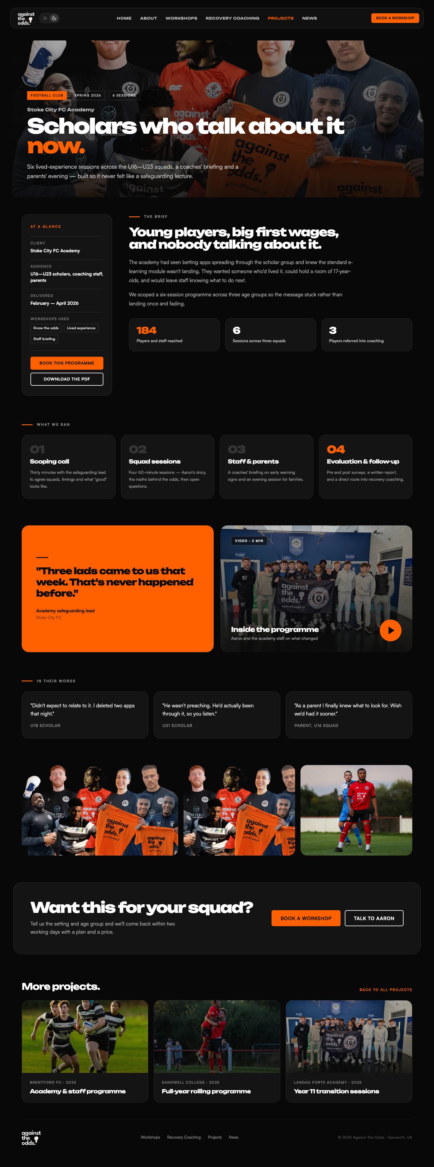
againsttheodds.uk/projects/edinburgh-rugby
Case study page design
Numbers first
Sessions delivered, players reached, rating — before any narrative.
One pull quote
Named, with role and date. Unpolished language stays in.
Repeatable
You can publish a new study in under an hour — the template does the design.
08 · News

The Locker Room becomes News

Signed off — iteration A
againsttheodds.uk/news
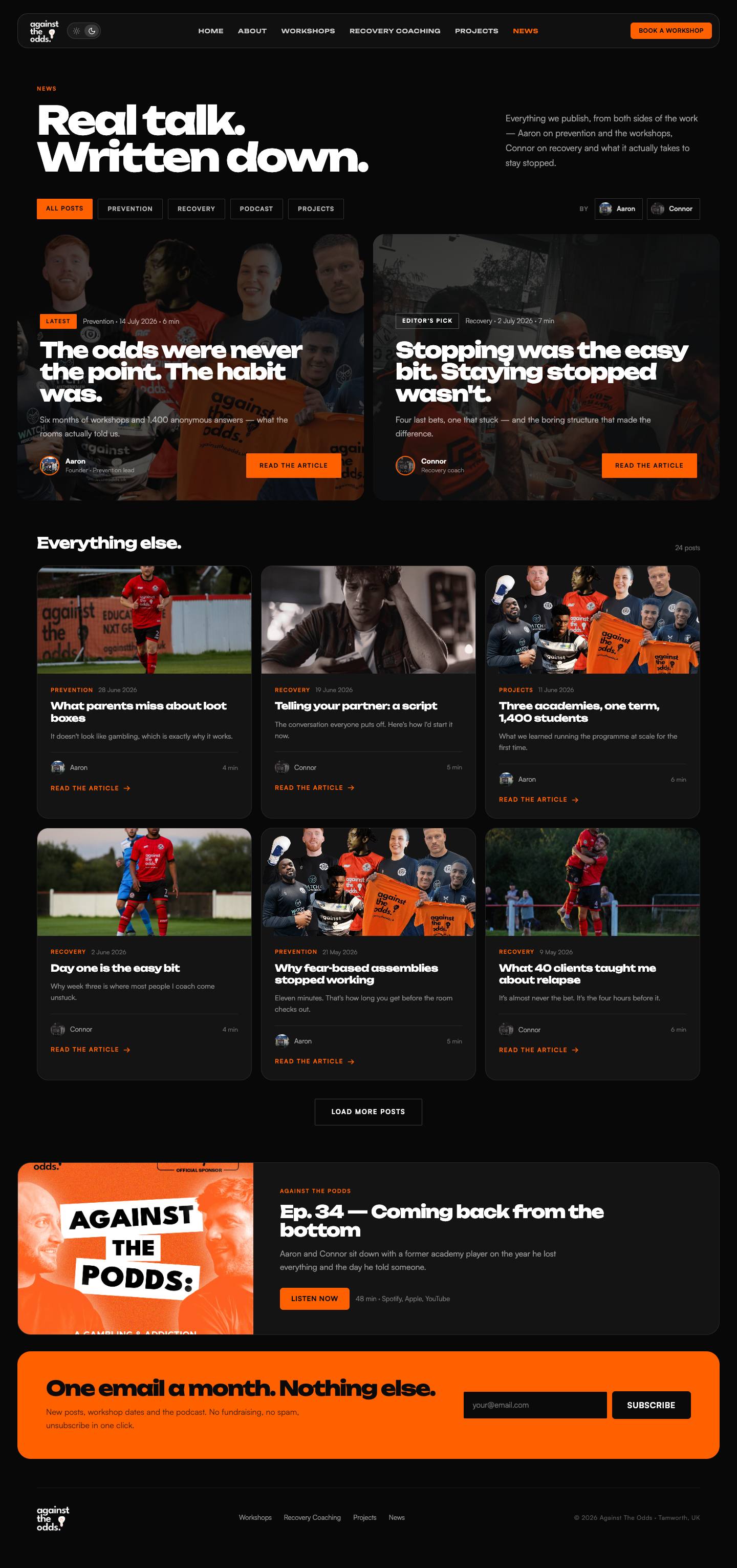
News index design
The rename
"News" is what people search for and what Google understands. Old links redirect.
Read time
Every card shows date and minutes, so nothing feels like homework.
Post template
Two versions designed — Aaron's opinion pieces and Connor's first-person posts.
10 & 11 · Convert

Booking, and everything else

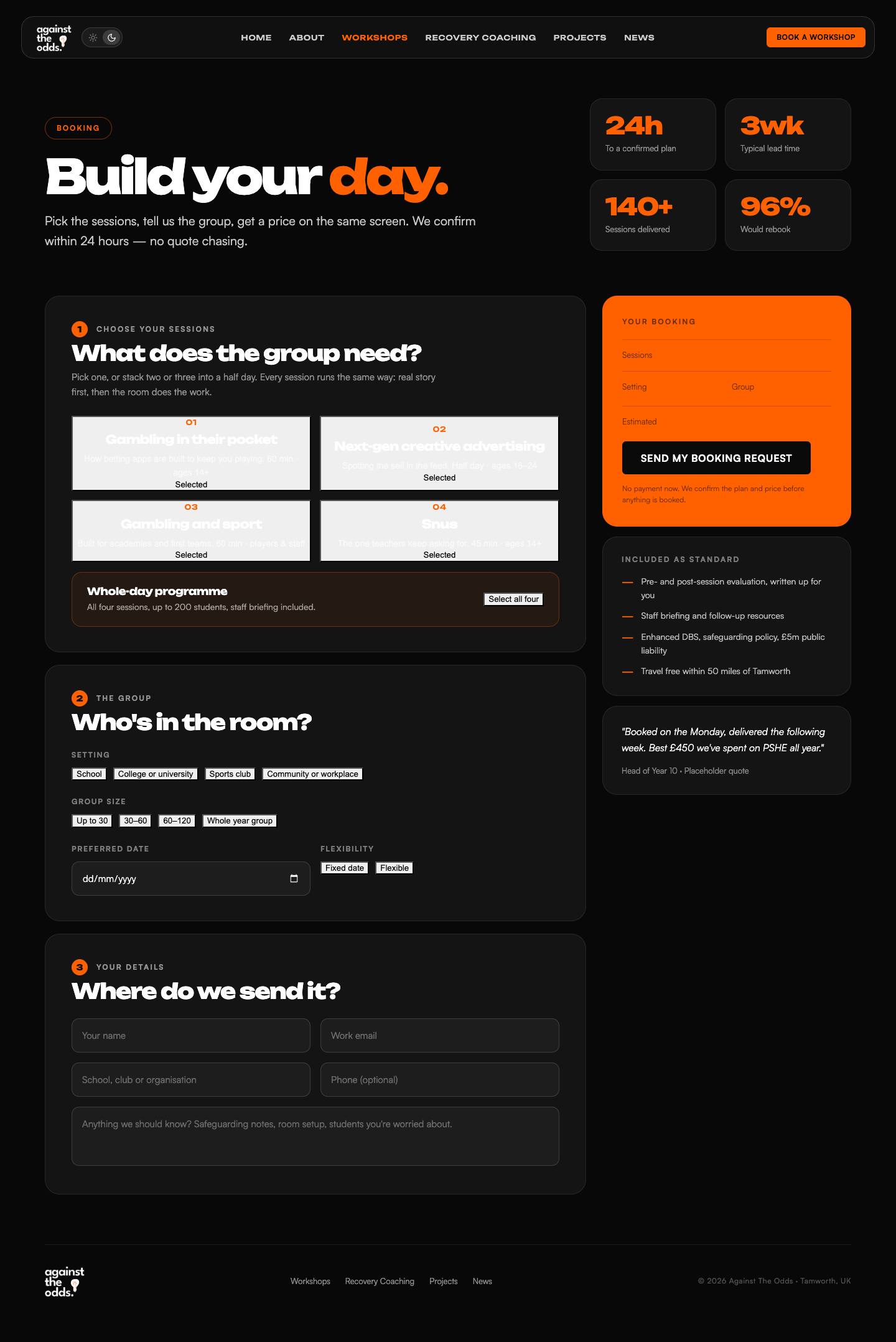
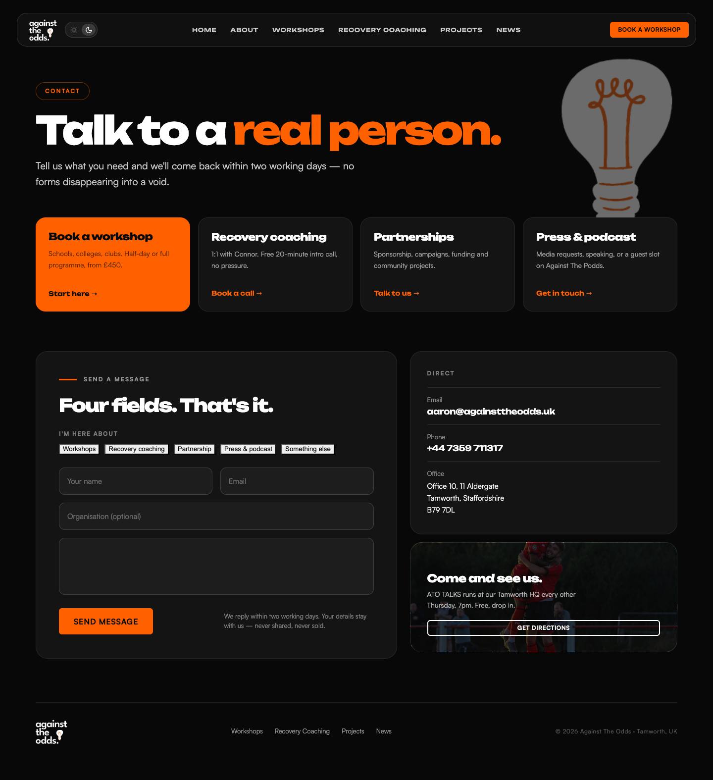
One form for workshops, one for general enquiries. Both under a minute to fill in.
againsttheodds.uk/book
Book a workshop design
againsttheodds.uk/contact
Contact page design
Pick the workshop first — the form knows what you're booking.
Five fields, no dropdown mazes, reply within two working days.
Support routes are separated from sales, so nobody in crisis hits a booking form.
Mobile

Designed on the phone first

Full-width cards, 48px tap targets, and the book-a-workshop button pinned to the bottom of the screen.
Homepage on mobile
Homepage
Prevention on mobile
Workshops
Recovery on mobile
Recovery
Case study on mobile
Case study
Book a workshop on mobile
Book a workshop
Themes

Every page in dark and light

Both themes are fully designed — 24 screens. Dark ships as the default.
againsttheodds.uk
Homepage in dark mode
Dark — default
againsttheodds.uk
Homepage in light mode
Light — toggle beside the logo
Foundations

One system behind all twelve pages

Colour
Three colours only. Orange is for action — never a background for body copy.
Type
Unbounded
Display, 700–900, tight leading
Satoshi
Body and UI, 400–700
Components
Book a workshop Get support
Sharp 2px corners, one primary button per section, 1.5px card borders.
Delivery

From signed off to live

Phase 1
Content lock
Confirmed evaluation figures, prices, both videos, session photography.
Phase 2
Build
Twelve pages built to the signed-off designs, editable in a simple CMS.
Phase 3
Review
Staging link for you and Connor, plus a pass on speed and accessibility.
Phase 4
Launch
Redirects from the old URLs, analytics on the two CTAs, then live.
What we need from you
The confirmed numbers, Connor's tier prices, and the two videos.
What we handle
Build, hosting, redirects, analytics and the handover session.
Against The Odds
Next step

Would you get in touch with these guys?

That was the test. Say the word and we lock the content list this week.